Inclusive Design Drives Smartwatch Adoption
Smart Wearable Device Company : Bridging the Digital Divide
Breaking Tech Barriers for All Age Groups
This client company is an internationally recognized American wearable device brand. Known for its activity trackers, the company is a leader in the wearable device industry. These devices track users' steps, distance, calories burned, sleep patterns, and more. The client's products include smartwatches, scales, and fitness trackers, with over 120 million active users worldwide.

Customer Profile
This client company is an internationally recognized American wearable device brand. Known for its activity trackers, the company is a leader in the wearable device industry. These devices track users' steps, distance, calories burned, sleep patterns, and more. The client's products include smartwatches, scales, and fitness trackers, with over 120 million active users worldwide.
Challenges
The advancement of technology has indeed made life more convenient, allowing both the elderly and children to benefit from the features of smartwatches. However, older users often experience anxiety when faced with new technologies. Regardless of how many attractive features a smartwatch provides, elderly users may be less willing to use them due to difficulties they encounter in initial use.
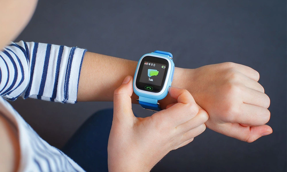
Therefore, the client company hopes to find solutions that reduce user frustration and increase new users' trust in the new technology. On the other hand, the client company believes that smartwatches used by children should be more concise, allowing children to establish correct concepts of technology use in a practical and fun way.


Solutions
The design team at Cloud Interactive caters to diverse age groups' usage for smartwatches through outstanding UI/UX design, aiming to increase consumer willingness to use the product. Prior to project initiation, the team conducted one-on-one interviews with representative users: seniors aged 65 and above and children aged 6-12. Our team also assisted participants in pairing their mobile devices with smartwatches, observing and collecting user feedback throughout the collaborative process.
To overcome barriers for elderly users to adopt new technology, our interface design emphasizes color contrast and large fonts to enhance readability, while presenting information in a simple and clear way to enhance user trust. In addition, we ensure that the "Fall Detection" function interface is clear at a glance and that the "Emergency Help" and "Cancel" buttons are clearly understood so that the elderly can respond more intuitively and quickly in emergencies.
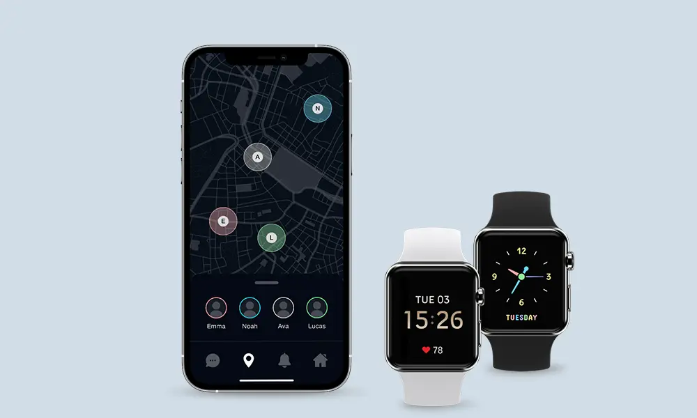
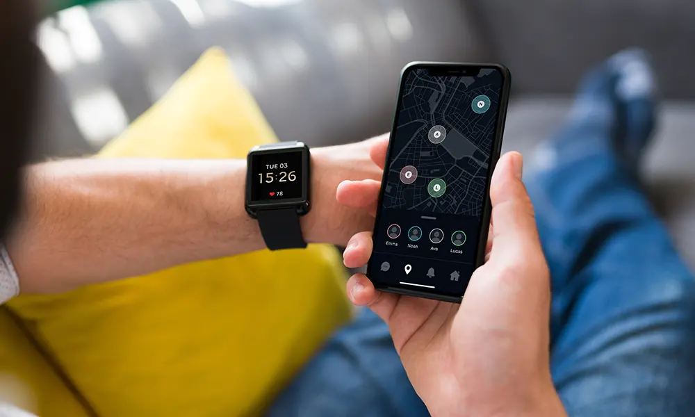
For children, our team designed fun characters within the interface to make the experience more enjoyable. Understanding that parents primarily use the app to monitor their children's safety and stay connected. Therefore, the app interface also ensures that the GPS positioning function is easy to use and displays the current location intuitively on the map.


